
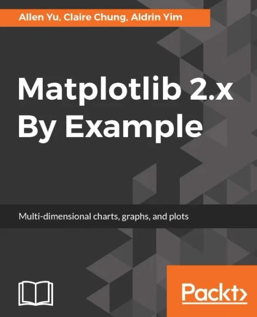

Matplotlib 2.x By Example: Multi-dimensional charts, graphs, and plots in Python
Paperback 334 pages English Aug 28, 2017
(No reviews yet)
Write a Review
Write a Review
Packt Publishing
Matplotlib 2.x By Example: Multi-dimensional charts, graphs, and plots in Python
Millions of titlesEvery book you're looking for
Carbon-neutral shippingFree on orders over $39.99
Fast shipping worldwideDelivered to your door
Unlock deeper insights into visualization in form of 2D and 3D graphs using Matplotlib 2.x Key Features Create and customize live graphs, by adding style, color, font to make appealing graphs. A complete guide with insightful use cases and examples to perform data visualizations with Matplotlib's extensive toolkits. Create timestamp data visualizations on 2D and 3D graphs in form of plots, histogram, bar charts, scatterplots and more. Book Description Big data analytics are driving innovations in scientific research, digital marketing, policy-making and much more. Matplotlib offers simple but powerful plotting interface, versatile plot types and robust customization. Matplotlib 2.x By Example illustrates the methods and applications of various plot types through real world examples. It begins by giving readers the basic know-how on how to create and customize plots by Matplotlib. It further covers how to plot different types of economic data in the form of 2D and 3D graphs, which give insights from a deluge of data from public repositories, such as Quandl Finance. You will learn to visualize geographical data on maps and implement interactive charts. By the end of this book, you will become well versed with Matplotlib in your day-to-day work to perform advanced data visualization. This book will guide you to prepare high quality figures for manuscripts and presentations. You will learn to create intuitive info-graphics and reshaping your message crisply understandable. What you will learn Familiarize with the latest features in Matplotlib 2.x Create data visualizations on 2D and 3D charts in the form of bar charts, bubble charts, heat maps, histograms, scatter plots, stacked area charts, swarm plots and many more. Make clear and appealing figures for scientific publications. Create interactive charts and animation. Extend the functionalities of Matplotlib with third-party packages, such as Basemap, GeoPandas, Mplot3d, Pandas, Scikit-learn, and Seaborn. Design intuitive infographics for effective storytelling.
- Author:
- Allen Yu, Claire Chung, Aldrin Yim
- Publisher:
- Packt Publishing
- Publication Date:
- Aug 28, 2017
- Number of pages:
- 334 pages
- Language:
- English
- Binding:
- Paperback
- ISBN-10:
- 1788295269
- ISBN-13:
- 9781788295260